Saturday 28 October 2017

The Morning shadows - A soft pastel painting

"The beautiful is in nature, and it is encountered under the most diverse forms of reality. Once it is found it belongs to art, or rather to the artist who discovers it." Gustave Courbet

I love to paint both landscapes and portraits. In fact what unifies every subject is light. The light that falls on the different elements in the subject defines its form and shape and helps reveal its colours. Pastels are a vibrant and ideal medium to capture this light and shadow effect in paintings.

Today's post is a soft pastel painting of a scene that I came across while I was at Karnala Bird Sanctuary recently. It was about ten in the morning and the shadows of the tall trees fell across the road creating interesting patterns. There is so much beauty that lies hidden in the nature and as an artist we try to capture it on to the paper using our vision and interpretation.

To know about the pastel palette that I use, CLICK HERE.
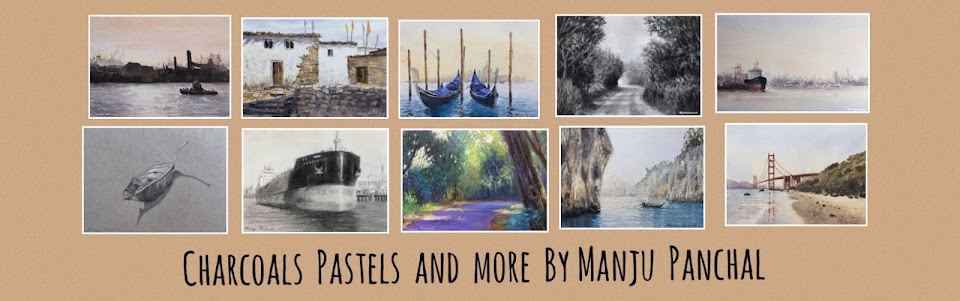
Soft pastel painting of a scene from Karnala Bird Sanctuary

The Morning Shadows
Soft Pastel painting on Canson MT paper
Size 5" X 7"

The initial steps involved in creating the above painting are as follows. I have used a beige coloured Canson paper for this artwork. Canson MT comes in many different colours which is a big advantage to the artist. In this painting a major part of the composition was sky, hence I wanted to use a light toned paper as the base.

Step by step soft pastel painting

Step 1. After drawing a faint outline keeping the one third rule of composition, 
I blocked in the major shapes. At this stage I only look at simplifying the 
shapes and adding the colours as per value study.

Step by step soft pastel painting

Step 2. I add another layer of colours, laying emphasis on the dark tones, mid tones and the
highlights. At this moment, I pay attention to linear and atmospheric perspective
creating depth. I work on the shadows, the tree trunks and foliage.

In the final step I added a few necessary details like branches, sunlit foliage etc in the middle ground. At this stage I make use of my Koh-I-Noor soft pastel pencils. At some point of time I decide to call it quits to avoid overworking on the artwork.

Thanks for browsing through my artworks.Visit my INSTAGRAM page to view my works in other mediums as well. 

Wednesday 25 October 2017

From photograph to charcoal drawing

"While drawing, I discover what I really want to say."Dario Fo

As an artist I am always looking for meaningful quotes as they speak my thoughts and keep me inspired. The above quote holds true, I guess for most of us. It is through our art that we slowly discover what we are trying to convey to the viewers. 

Malshej Ghat is a mountain pass in the Western Ghats range in the Thane-Pune district of Maharashtra, India.The site is nestled in the lofty rugged hills of the Western Ghats. The road journey to this place will take you through winding roads, lush greenery on either sides, thick dense fog and countless number of waterfalls touching the highway. 

We visited this place in the monsoon season this year and I found some perfect subjects that I was looking to paint.. My today's post is a charcoal drawing of one such scene from Malshej Ghats wherein the majestic mountain slopes can be seen fading off in the distance. This drawing was not planned but while browsing through my stationery I came across a white sheet of Canson Mi Teintes which initiated the idea of experimenting with this paper out for my charcoal drawing?. 

I love to experiment with new papers all the time. I have created a post regarding the "Papers I use for my charcoal drawings". After using Canson Mi Teintes, I am quite convinced that it will be an added paper in my list for charcoal drawings. It has this beautiful sanded smooth surface ( which I also use for my pastel drawings ) which takes on the charcoal pretty well.

Sometimes it takes just one drawing to come to a conclusion and there are times when you want to check a paper/paint again and again and you are not really sure if it is going to work for you. 

Charcoal drawing and sketching of a scene from Malshej Ghat, Maharashtra by Manju Panchal

Monsoon at Malshej Ghats
Charcoal drawing on Canson MT paper.
Size 5.5" X 7"

Initial stage of a charcoal drawing, a scene from Malshej ghat

Initial stage of charcoal drawing

The above image shows the initial stages of the charcoal drawing wherein I have "Blocked In" the different elements in the scene, namely the sky, the mountains slopes etc using charcoal powder and my other blending tools.  The distant mountain slopes are kept light and without any details to create atmospheric depth.

In the subsequent layers I use the pencils and the kneaded eraser to create the highlights and shadows

A monsoon scene from Malshej Ghat, Maharashtra

The photograph from Malshej Ghats
which inspired me to create the charcoal
drawing such as above.

While on location, I try and take a few different photographs with different compositions and later after a little editing I use the image that looks good to to be converted into a painting. I also do a few quick "Thumbnail sketches" using my charcoal pencil and sketch book to roughly block in the value scale in the scene. It always helps. 

Follow my latest works and techniques on INSTAGRAM , where in I post my latest artworks regularly. 


Sunday 22 October 2017

Watercolour Artist - Sadhu Aliyur

"In art, the hand can never execute anything higher than the heart can imagine." 
Ralph Waldo Emerson

Instagram is new to me and I have started posting my works on this social media quite recently. Blogging is about my art journey wherein I share my art, my techniques, my experiments and my general thoughts and feelings about creating my art. Instagram on the other hand is a faster way of uploading my work and most important, all my works can be seen in a gallery format. In conclusion, as an artist, I am enjoying being a part of Instagram.

Through Instagram I am getting to meet many different artists from India as well as all around the world. Some of them have inspired me in a lot many ways and I have decided to create a post about each one of them. Today I am posting about a great water colour artist Mr Sadhu Aliyur.

Mr Sadhu Aliyur is a Kerala based water colour artist. His finely honed skills, astute observation and refined aesthetic sensibilities help him capture the essence of a scene in a few strokes. He makes the common look uncommon. He transforms the ordinary into the extraordinary.

In his hands, nature comes alive in all its richness, textures, hues and forms. With a wash here and a dab there, the overwhelming beauty of the monsoon, skies and rain drenched dwellings are frozen for all time for the eyes of the connoisseur. Read more about him.....CLICK HERE.
( COURTESY: SADHU ALIYUR )

All works created by Mr Sadhu Aliyur are absolutely vibrant and stunning. His thoughts, feelings, conviction, and many moods seem to come alive with bare minimal strokes. The simple landscape scenes capture the mood and atmosphere so well. I have been following his works for quite some time now and decided to share some of them with you.

Check out his other works on his official website.

A water colour painting by Sadhu Aliyur

A water colour painting by Sadhu Aliyur

A water colour painting by Sadhu Aliyur

A water colour painting by Sadhu Aliyur

A water colour painting by Sadhu Aliyur

A water colour painting by Sadhu Aliyur

A water colour painting by Sadhu Aliyur

A water colour painting by Sadhu Aliyur

A water colour painting by Sadhu Aliyur

A water colour painting by Sadhu Aliyur


A water colour painting by Sadhu Aliyur

Each and every painting by Mr Sadhu Aliyur is so unique in itself, be it a still life, portrait or landscape, that you can't help but fall in love with it. 

Follow my latest works and techniques on INSTAGRAM , where in I post my latest artworks regularly. 

Thanks for browsing through my blog.🙏

Thursday 19 October 2017

Step by step, a soft pastel painting of a landscape from Bharatpur, Rajasthan

"Colour is the pulse of the painting." Michele Cooper

Keoladeo Ghana National park formerly known as Bharatpur Bird Sanctuary is in Bharatpur, Rajasthan. One third of the park is wetland systems with varying types of microhabitats having trees, mounds, dykes and open water with or without submerged or emergent plants. The uplands have grasslands ( Savannas ) of tall species of grass together with scattered trees and shrubs present in varying density. ( COURTESY: WIKIPEDIA )

We were there some years back in the month of November. The pastel painting as below is of a morning scene at this Sanctuary. We were in the boat with a guide who was rowing the boat at a very gentle pace so as to avoid disturbing the nesting birds. The morning sun rays lit up the tall dry grass blades and the scene came up so live and vibrant with colours. The warm colours of the sunlit grass was such a contrast to the cool colours of the shadows in the surroundings.

I enjoyed creating this pastel painting and used Mungyo, Koh-I-Noor and Sennelier pastels for the same. To know about the papers that I use for my soft pastel paintings you can CLICK HERE.

A soft pastel painting of a scene from Bharatpur Bird Sanctuary, Rajasthan by Manju Panchal

The Morning Glow
Soft pastel painting on Canson MT paper
Size 6"X 8"

The soft pastel painting "The Morning Glow"progressed in stages. I am posting two images below.

Step 1 A soft pastel painting of a scene from Bharatpur Bird Sanctuary, Rajasthan

Step 1. Keeping the composition in mind, I drew a faint outline
and then blocked in the major shapes using the underlying 
dark colours keeping in mind the values.
( The sky and water were painted in similar colours )

Step 2 A soft pastel painting of a scene from Bharatpur Bird Sanctuary, Rajasthan

Step 2. Started the second layer of colours, adding details and
strokes to suggest foliage, grass etc.Smudging only
if required, else I just leave original pastel strokes.

Step 3. In the final stage of the pastel painting, I add the finishing touches ie adding the glow to the tips of the grass, creating few branches in the tree using pastel pencils, few grasses on the lake along with its reflection.

I purchased a few Koh-I-Noor individual pastel pencils from ART LOUNGE while it was running its annual sale earlier this year. 
Koh-I-Noor soft pastel pencils

My collection of pastel pencils

Before attempting this scene in soft pastels, I did a small study work of the same using willow charcoal and charcoal pencil. To view the value study CLICK HERE. Creating a tonal value study work always helps in a better understanding of the subject that I am going to paint in the coloured medium.

I hope you have enjoyed browsing through my blog. Thanks for taking out your precious time and visiting here. Your comments are welcome.

Monday 16 October 2017

Step by Step, Water colour painting of Gurudongmar Lake

"I begin with an idea and then it becomes something else." Pablo Picasso

Every painting is inspired by some thought, some place, some vision that you have in mind. It slowly builds up in layers and then when the final moment of execution arrives, you let the energy flow on to the paper. Gurudongmar Lake in North Sikkim is one such place which is indelibly printed in my memory and it will continue to inspire me to make many paintings in future.

The moments we spent there were magical. It was like a dream come true to see nature in its pristine form. Today's post is a water colour painting of one such scene that we came across while we were at 17,100 ft, facing the majestic snow covered mountains and the stunning Gurudongmar Lake.

A water colour painting of Gurudongmar Lake in North Sikkim

Magical
Water colour painting on Campap paper
Size 5.5" X 8"

For this particular work, I decided to photograph the initial stages of the painting. I have used a very limited palette for this painting. The initial drawing that I do is very light and I use a normal HB pencil for the same. I avoid erasing as it disturbs the surface fibres on the paper.

Step by step water colour painting of Gurudongmar Lake

Step 1. Wet on wet technique, sky and mountains, 
using Winsor and Newton Ultramarine blue, Cerulean blue
 and Alizarin Crimson.

Step by step water colour painting of Gurudongmar Lake

Step 2.  Created the mountains in the Middleground using Raw Sienna,
Ultramarine blue, Indian red and Burnt Sienna ( Camlin brand )

In the final stage I created the lake waters, which are reflection of colours of the sky ie Ultramarine blue and Cerulean blue. For the shadows on the snow I have used a mix of Ultramarine Blue and Alizarin Crimson colour.

Hope you have enjoyed going through my blog. It feels great to be painting and blogging and thanks to my blog, I am getting connected with people who are as passionate about art as me. If you love water colour medium, do browse through the works of Joseph Zbukvik, Alvaro Castagnet and Keiko Tanabe to name a few. All these world famous master water colorists have a style of their own and it is a pleasure watching their works.

Thanks for visiting my blog.

Friday 13 October 2017

Soft pastel painting

"In nature, light creates the colour. In painting, colour creates the light."Hans Hoffman

Pastels is a vibrant dry medium and I got into using it a few years back. I started with Camlin and Mungyo and then went on to purchase Koh-I-Noor and Gallery too. My latest brand in pastel collection is Sennelier which is very very expensive, however it is very soft and creamy and has deep rich colours. I have not used it much but plan to do so soon as the last and final layer on my paintings.

My today's post is an old work, a scene .from Mahabaleshwar which I created a some time back. Evaluating older paintings has become a norm and I always find a few mistakes here and there. So I touched up this painting with Sennelier pastels and was satisfied with the final results. 

Subjects such as these ie "Forest scenes" with winding pathways appeal to me a lot. I also get inspired by the sunlight that perforates through the foliage to lighten up the pathway at places. The light that falls on all the elements of the nature defines the form and shape and with every painting that we do we learn to see and observe.  

A soft pastel painting of a landscape by Manju Panchal

Light at the distance
A soft pastel painting on Canson MT paper
Size 8"X 12"

The greens in the landscape are always the biggest challenge and it continues to intimidate me. This colour along with blue is so predominant that it can be a mystery which gets tricky to solve. The only solution I find is to continue painting, have a keen observation and with time and experience it all gets better. 

I created a post on "The papers I use for my soft pastel artworks" in May, 2016 wherein I have written in detail about my experience with different papers before shortlisting the ones that I use today.  

Thank you for visiting my blog and CLICK HERE to browse through my gallery of paintings in other mediums as well. 

Tuesday 10 October 2017

Pangong lake, Ladakh

"The Earth does not belong to us: we belong to the Earth." Marlee Matlin

That's a meaningful quote which reminds us to take care of the beautiful natural world around us.  

Pangong lake in Ladakh is a stunning lake surrounded by snow capped mountains. I created a small water colour painting of this lake yesterday on Strathmore water colour paper

To get the beautiful shades of blue in the lake I have used Winsor and Newton cotman colours namely cerulean blue and ultramarine blue. For most of my water colour artworks I am presently using a mix of Camlin and Winsor and Newton, Palette.

Water colour painting of Pangong lake in Ladakh, on Strathmore paper

Pangong Lake, Ladakh
Water colour painting on Strathmore paper
Size 5.5" X  8"

My art is deeply influenced by the beauty of the natural world around us and places such as above continue to inspire me to pursue my art journey. Escaping into the world of art is my idea of meditation. It keeps me busy and happy.

If you wish to attend any of my art workshops you can write a mail to me and I shall get back to you as soon as possible. Thanks for visiting my blog and please take a moment to leave a comment.

CLICK HERE to browse through my available paintings.

Saturday 7 October 2017

Portrait drawing using Cretacolour and Camlin graphite pencil

"Drawing is vision on paper." Andrew Loomis

Graphite is a part of every artist's toolbox. It's affordable and a commonly used medium, yet if used on its own, in the hands of a skillled artist, it can produce breathtaking works of art. The lead in graphite pencils is made from a natural rock that is mined. In fact graphite and diamonds are the only two forms of carbon polymers occurring in nature. ( Courtesy: Craftsy.com )

My today's post is another "Portrait study" that I have created using the graphite medium. Graphite pencils are available in different grades ranging from 9H to 9B. H stands for hardness and B for blackness. I have a big collection of different grade pencils but I prefer to use just a few of them. In the portrait as below I have used 2B and 4B Staedtler graphite pencils for the midtones. For the darker tones I have used 8B Cretacolour and 10B Camlin graphite pencils.

Portrait study of an Indian woman created using graphite pencil.

Portrait study 
Graphite/Pencil drawing on Strathmore Gray toned paper
Size 5"X 7"

It is very difficult to obtain true black colour using graphite pencil because when the paper gets saturated by several layers of graphite, it tends to give a glare. Therefore one can use charcoal as a final layer to create further darkness, however I have avoided using charcoal in the above work. For the highlights I have used Conte and Cretacolour white pastel pencil.

Like charcoal, pencil drawings too tend to smudge. Hence I cover it with a sheet of butter paper before storing it neatly in a folder. A question that I am frequently asked regarding my charcoal and pastel works is whether I use a fixative in the final stages of the artwork. I have a "Winsor and Newton" fixative with me but I rarely use it on my artworks. 

CLICK HERE to browse through some of my graphite drawings in my sketchbook.

Thanks a lot for browsing through my artworks.

Thursday 5 October 2017

Graphite Pencil Portrait on toned paper

"How you draw is a reflection of how you feel about the world. You are not capturing it, you are interpreting it." Juliette Aristides

My today's post is a graphite "Portrait study work" on Strathmore toned paper which I started almost a week back. I am working with graphite medium after a long gap of time. It is interesting to get back to a medium that you have used in the past. Every medium has its own advantages. Pencil is a drawing tool that we all have used as kids when we were growing up. 

I have a miscellaneous collection of pencils but for this particular portrait drawing I decided to use the following three,
  1. Cretacolour 8B graphite pencil ( Purchased from Amazon.in )
  2. Camlin 10B graphite pencil ( Very dark shade )
  3. Staedtler 2B and 4B graphite pencils
I enjoyed working with graphite pencil on Strathmore paper. This paper has a very smooth texture as compared to my usual Canson MT toned paper. However for portrait drawing it seems quite a prefect choice.

Portrait study on Strathmore gray toned paper using graphite pencil

Portrait study work
using graphite pencil
on Strathmore Gray toned paper
Size 5"X 7"

I am working on yet another portrait drawing on Strathmore paper and I shall post it once completed.
My works can also be seen in a gallery format on INSTAGRAM. On instagram, I am getting to meet many different artists and I would love to write a post about them and their works.

If you are into water colour medium then visit the Instagram page of artists Sadhu Aliur and Bijay Biswaal. The water colour works by both these artists are amazing. 

Thanks for visiting my blog and browsing through my works.